Visualising performance to help health professionals improve the quality of cancer care
Te Aho o Te Kahu’s quality performance indicator programme measures and compares the services received by people with cancer with the goal of identifying areas for improvement.
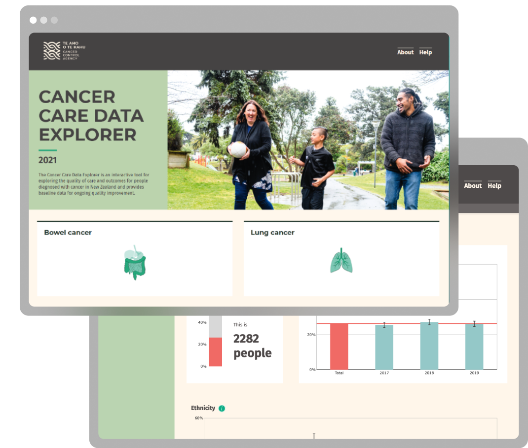
The Cancer Care Data Explorer uses specialised data visualisations to share how certain indicators are performing across the country.
Te Aho o Te Kahu | Cancer Control Agency
Explore the work here:
Improving quality of care
Te Aho o Te Kahu's quality performance indicator programme measures and compares the services received by cancer patients.
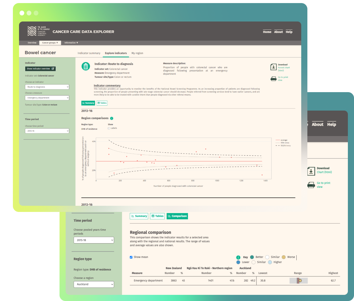
To help communicate the outputs from the monitoring programme, we worked with the agency’s technical experts to develop the Cancer Care Data Explorer. The interactive tool helps stakeholders explore quality of care and outcomes for people diagnosed with cancer nationally and in different regions of the country.
Comparing performance
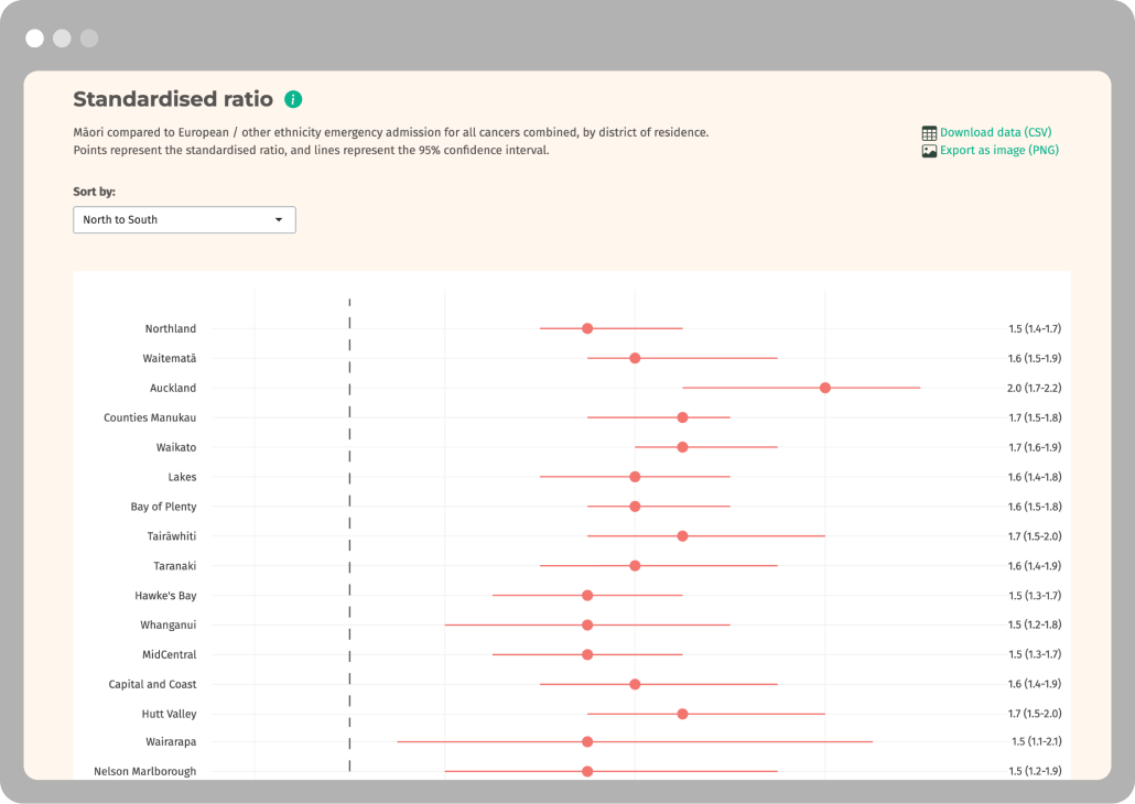
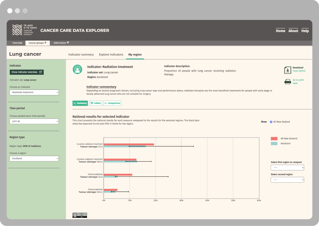
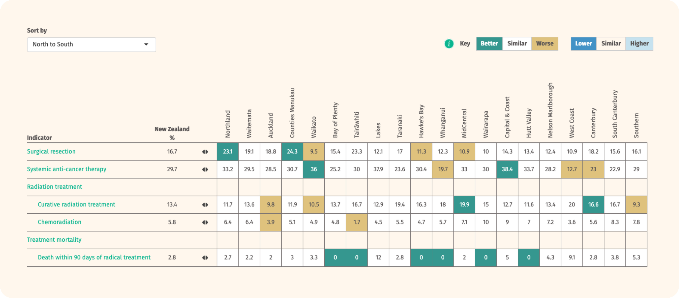
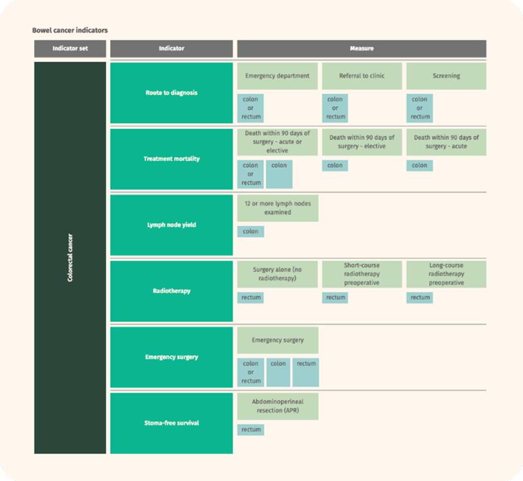
The Cancer Care Data Explorer uses specialised data visualisations to share how certain indicators are performing across the country. For example, colour coded tables and spine charts are used to display how a region is performing against the national average.
Ongoing quality improvement
The interactive dashboard helps stakeholders explore quality of care and outcomes for people diagnosed with cancer nationally and in different regions of the country.
Technically robust and scalable
The dashboard was built with the intention of adding new cancer types and datasets over time. To enable this increased data scope, a highly modular architecture was created which dynamically composes the application interface based on whatever data is available. Whenever a new cancer type dataset becomes available, all it takes to include this in the application is to upload the new dataset, then the modular interface and server logic does the rest. This also makes it easy to update the underlying data without needing to make many changes throughout a tightly coupled code base. We extended this modular code with bespoke data visualisations which are built specifically for this data structure.
Stakeholder-centric design
With attention to the information needs of policy makers the UX design was carefully crafted and put through several rounds of review before it was implemented.
Bespoke visualisations
Some of the visualisations are highly bespoke to meet best practice health data standards and technical conventions. This required careful choice of the R packages underlying the graphs.
Modularly built
The app was structured to enable the easy addition of cancer types and indicators. This allowed for an initial launch covering only major cancers and also enabled the team to easily add new features by themselves.
Indicator deep dive
In addition to the Cancer Care Data Explorer, we have expanded Te Aho o Te Kahu's suite of dashboards with the Route to Diagnosis dashboard. This dashboard shares data relating to people diagnosed with cancer within 30-days of an emergency or acute (unplanned) hospital admission; informing stakeholders on ways to improve cancer detection and diagnosis processes and reduce cancer diagnoses via emergency admission across Aotearoa New Zealand.