Insights into a global health issue
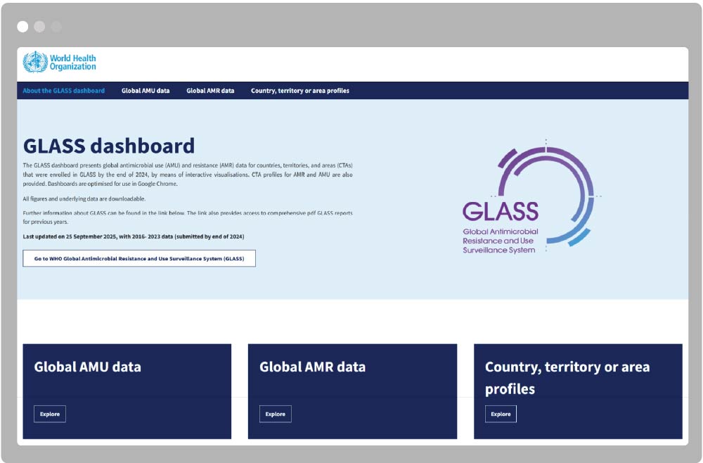
The WHO Global Antimicrobial Resistance and Use Surveillance System (GLASS) collects global insights on antimicrobial consumption (AMC) and antimicrobial resistance (AMR).
The GLASS dashboard summarises this comprehensive dataset into a single resource, supporting AMR surveillance and informing control strategies for this major threat to global health.
Transforming reports into intuitive visualisations
GLASS reports provide comprehensive and quality-assured data on the global and national incidence, prevalence and patterns of AMR, as well as the quantity and way in which antimicrobials are used (antimicrobial consumption (AMC)).
To help communicate outputs from the report, we worked with the GLASS team to automate how they generate their data visualisations and establish a dashboard complementing the annual report. The interactive tool supports surveillance and informs targeted actions to address this major threat to human health.
Purpose-built insights
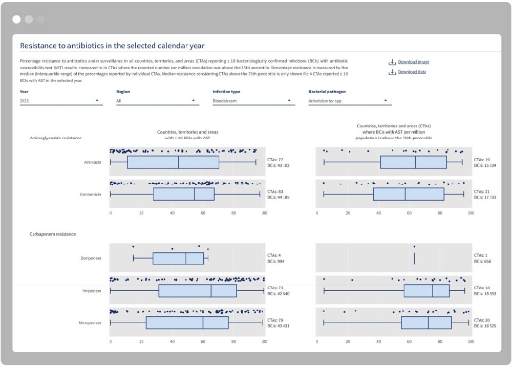
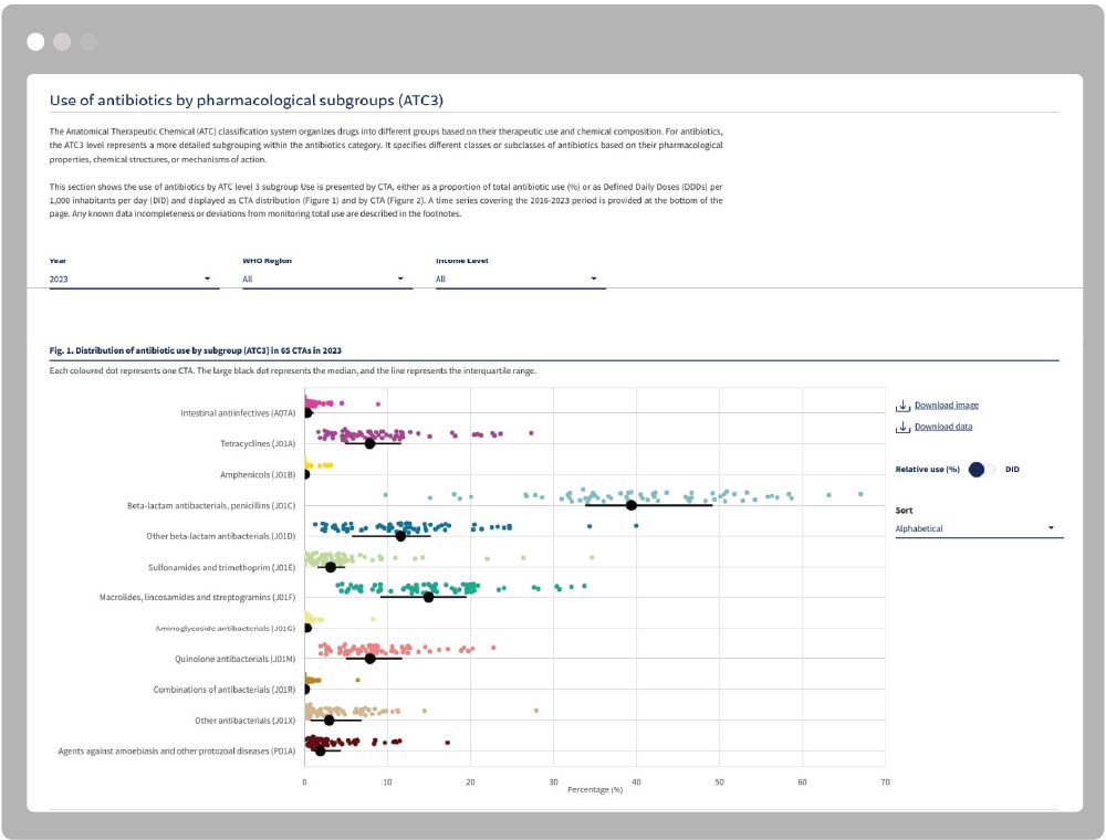
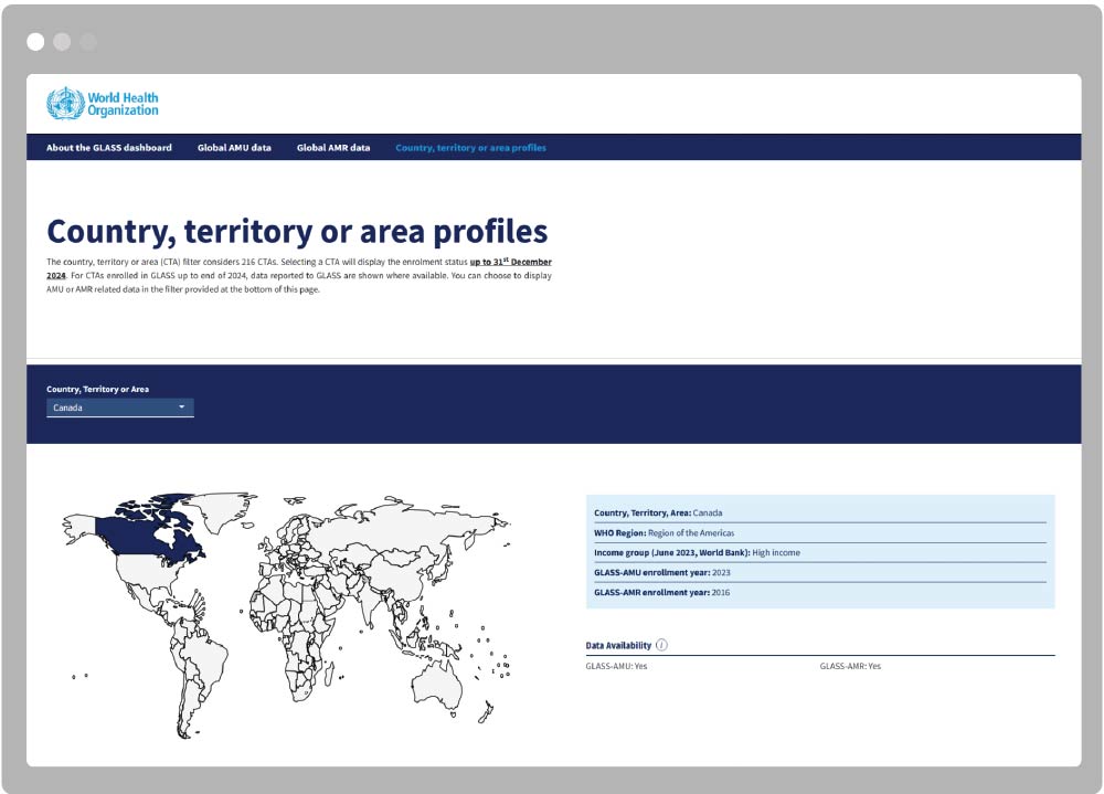
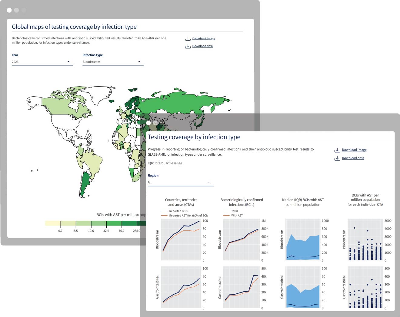
The dashboard displays global AMC and AMR data from GLASS-AMC and GLASS-AMR surveillance activities. Highly customisable visualisations empower users to engage with the data, exploring findings by pharmacological subgroup or infection type. The dashboard includes comprehensive country, territory, and area (CTA) views where users can investigate AMR and AMC data for a location they are interested in.
Informing targeted interventions
The tool provides a platform for stakeholders to explore AMR and AMC data in a range of different ways – including over time or by country, bacterial pathogen or antimicrobial. Data is presented at global, regional, and national levels, including individual CTA profiles, providing direct access to the underlying data of GLASS reports and supporting transparent dissemination of data.
A wealth of insight
The dashboard:
- Includes AMR and AMU data for the period 2016–2023, as reported by 141 countries, territories, and areas (CTAs) participating in the WHO global surveillance initiative.
- Includes over 23 million bacteriologically confirmed infection episodes reported by 110 CTAs contributing to GLASS between 2016 and 2023.
- Presents AMR data for eight bacterial pathogens frequently isolated from patients with bloodstream, gastrointestinal, urinary, or urogenital gonorrhoea infections.
- Displays resistance to 23 antibiotics across 11 antibiotic classes.
- Enables filtering by CTA, WHO Region, pathogen, and antimicrobial to support targeted data exploration.
"While the reports highlight key findings and offer actionable recommendations, the dashboard provides direct access to the underlying data, supporting transparent dissemination.”
Read the full press release here.
Scripted visualisation
We worked with the team to develop dedicated R scripts to make GLASS visualisations reproducible, standardised and easy to generate. We helped the team develop both static graphics for the traditional reports and interactive visualisations for the dashboard alongside each other to create complementary data products from the underlying data set.
Integrated with internal resources
Having supported the dashboard over several release cycles we worked closely with WHO’s internal IT team to deploy the Shiny app to their existing shinyapps.io account. To enable easy updates of the app we extended the dashboard to link to a custom API to pull data directly from WHO's internal data processing pipeline. This allowed us to minimise the amount of manual data processing required and increase the efficiency of the application.